The Colours to Wear in Spring 2026
A more refined, wearable approach to seasonal colour
Spring 2026 isn’t about chasing the loudest shade in the room. Instead, colour feels more intentional, designed to enhance a wardrobe rather than overwhelm it. There’s confidence in restraint this season, with tones that feel optimistic but grown-up, fresh yet grounding.
Rather than one headline colour dominating everything, the palette works best when layered thoughtfully. These are shades that slip easily into an existing wardrobe and quietly elevate what you already own.
Below are the colours shaping Spring 2026 and, more importantly, how to wear them in a way that feels natural, modern and genuinely wearable.
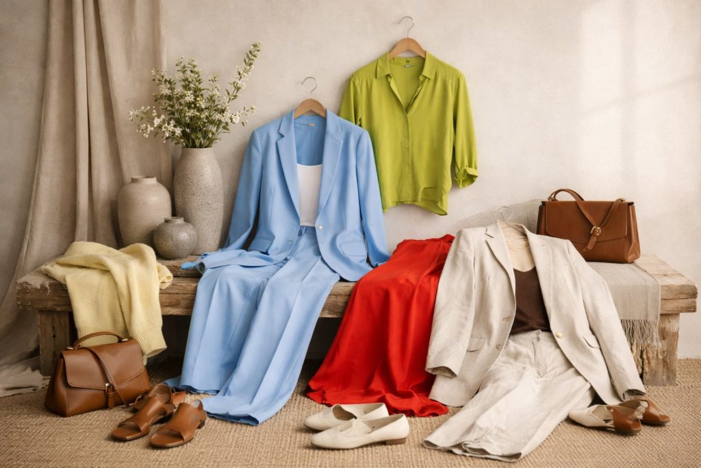
Butter Yellow
Soft, warm and surprisingly versatile, butter yellow emerges as one of the most flattering shades of the season. This isn’t a sugary pastel or a highlighter-bright yellow, it sits somewhere gentler, with a creamy undertone that feels elegant rather than playful.
How to wear it:
Butter yellow works beautifully when treated as a neutral-adjacent shade. Think fine knits with tailored trousers, fluid blouses under a classic blazer, or a simple dress paired with tan or chocolate accessories. It lifts an outfit without demanding attention.
Powder Blue
Powder blue brings a sense of calm to spring dressing. Clean, airy and polished, it feels particularly strong when used in structured pieces including tailoring, shirts and refined daywear.
How to wear it:
This colour shines when the cut does the work. A well-fitted blazer, crisp shirt or wide-leg trouser in powder blue feels modern and confident without being loud. Pair it with white, soft greys or warm neutrals to keep the look balanced.
Tomato Red
Spring 2026 red is warmer and more grounded than in previous seasons. Tomato red adds energy without tipping into drama. It’s bold, but approachable.
How to wear it:
This is a colour best worn with simplicity. Let it stand alone in one piece. A top, dress or knit, and keep the rest of the outfit understated. Neutral trousers, clean footwear and minimal jewellery allow the colour to feel intentional rather than overpowering.
Lime-Toned Greens
Green shifts brighter this season, but with a refined edge. Lime and citrus-adjacent tones add freshness and optimism, particularly when paired with softer foundations.
How to wear it:
These shades work best when balanced. Try them in relaxed silhouettes such as a lightweight dress, fluid trousers or a simple knit and anchored with cream, stone or warm beige. If you’re colour cautious, introduce it through accessories or layering pieces.
Soft Whites & Modern Neutrals
Spring 2026 relies heavily on softened neutrals. Clean whites with warmth, creamy ivories, oat, stone and mushroom tones create a calm base for brighter colours to sit against.
How to wear them:
These shades work beautifully layered together. Head-to-toe neutrals feel especially elevated when texture comes into play. Wearing linen, silk, fine wool and cotton blends add depth without colour overload. They also act as the perfect backdrop for stronger seasonal tones.
Chocolate & Earthy Browns
Brown continues its quiet rise, adding depth and warmth to spring wardrobes that might otherwise feel too light. These richer tones bring a sense of longevity to seasonal dressing.
How to wear them:
Chocolate brown pairs effortlessly with butter yellow, powder blue and soft whites. Use it in accessories, knitwear or tailored separates to ground lighter outfits and add polish.
How to Make the Palette Work for You
Spring 2026 colour is at its best when it’s edited, not layered all at once. The most effective outfits follow a simple rule: one statement colour, supported by calm foundations.
If you’re building this into your wardrobe, focus on:
One or two key colours that suit your skin tone and lifestyle.
Neutral pieces that anchor brighter shades.
Clean silhouettes that let colour feel intentional rather than trend-led.
This is exactly the approach I take during a wardrobe consultation, where we look at how colour fits into what you already own rather than starting from scratch.
Final Thought
The strength of Spring 2026 colour lies in its restraint. These shades aren’t designed to shout. They’re designed to last. When worn thoughtfully, they bring freshness to a wardrobe without compromising elegance or longevity.
Colour this Spring 2026 isn’t about reinventing your style. It’s about refining it.
To work with a Personal Stylist to incorporate these colours into your wardrobe or to rejuvenate your wardrobe for 2026, use the link below to book a call or send an enquiry.